I chose the colors for this ski company's new collection
plus some fun art direction, the inspiration behind the colors, and so many photos!
Hello friends!
I’m coming off of a lovely visit with Hadley here in Telluride. We hiked through Bear Creek and chatted about life and TOGS and future projects and everything in between. We took no photos together! Here’s a reenactment-
I feel so lucky to be on this journey with such a wonderful person. This is just the best.
This week, I’m writing about another fun journey I’ve been on!
Over the last year I’ve been helping my friends at Trew Gear choose colors for their award-winning Primo line. I also got to head the art direction and styling for this shoot, and I’m positively thrilled with how everything turned out.
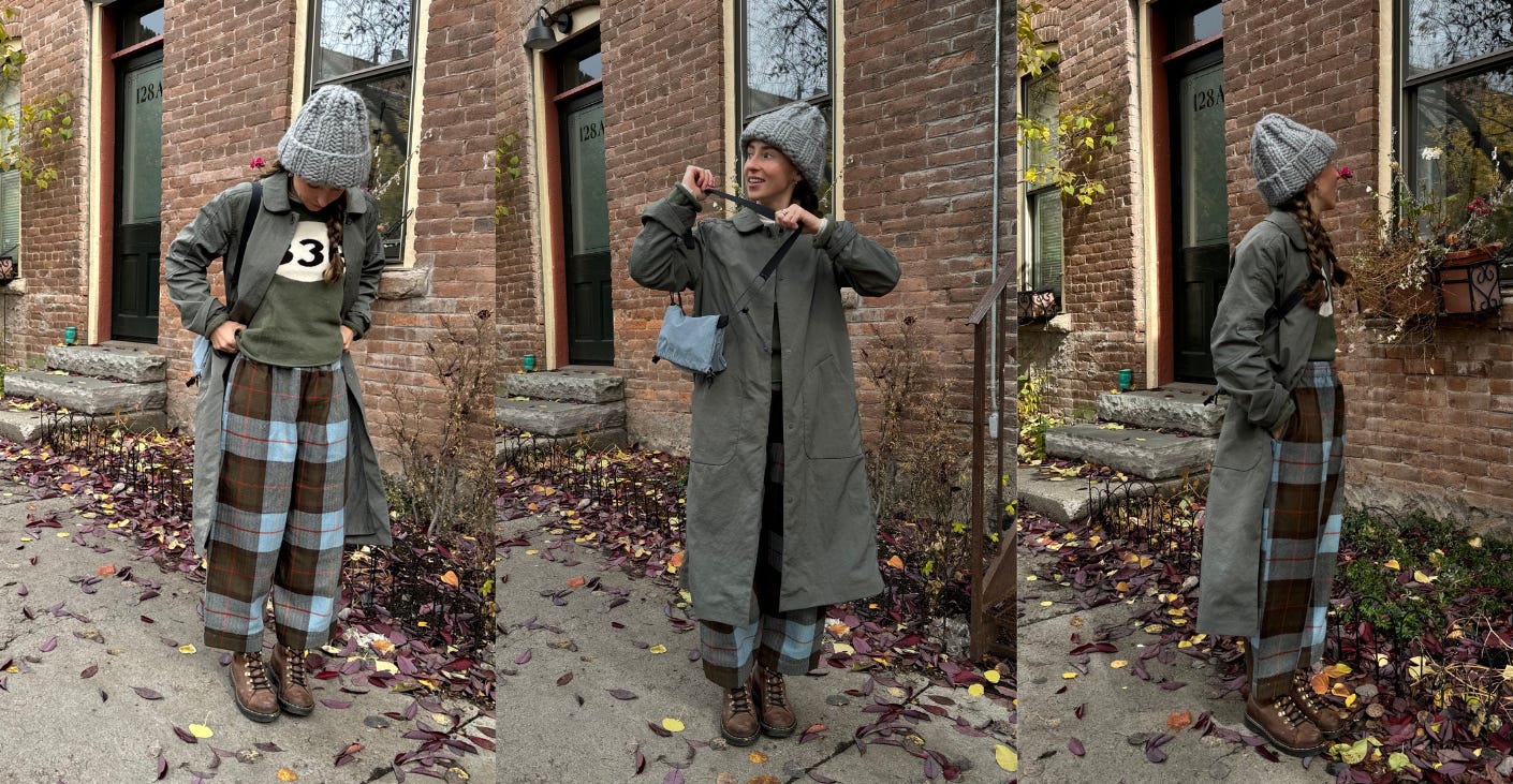
Before we jump in- here’s what I’m wearing today in Telluride:

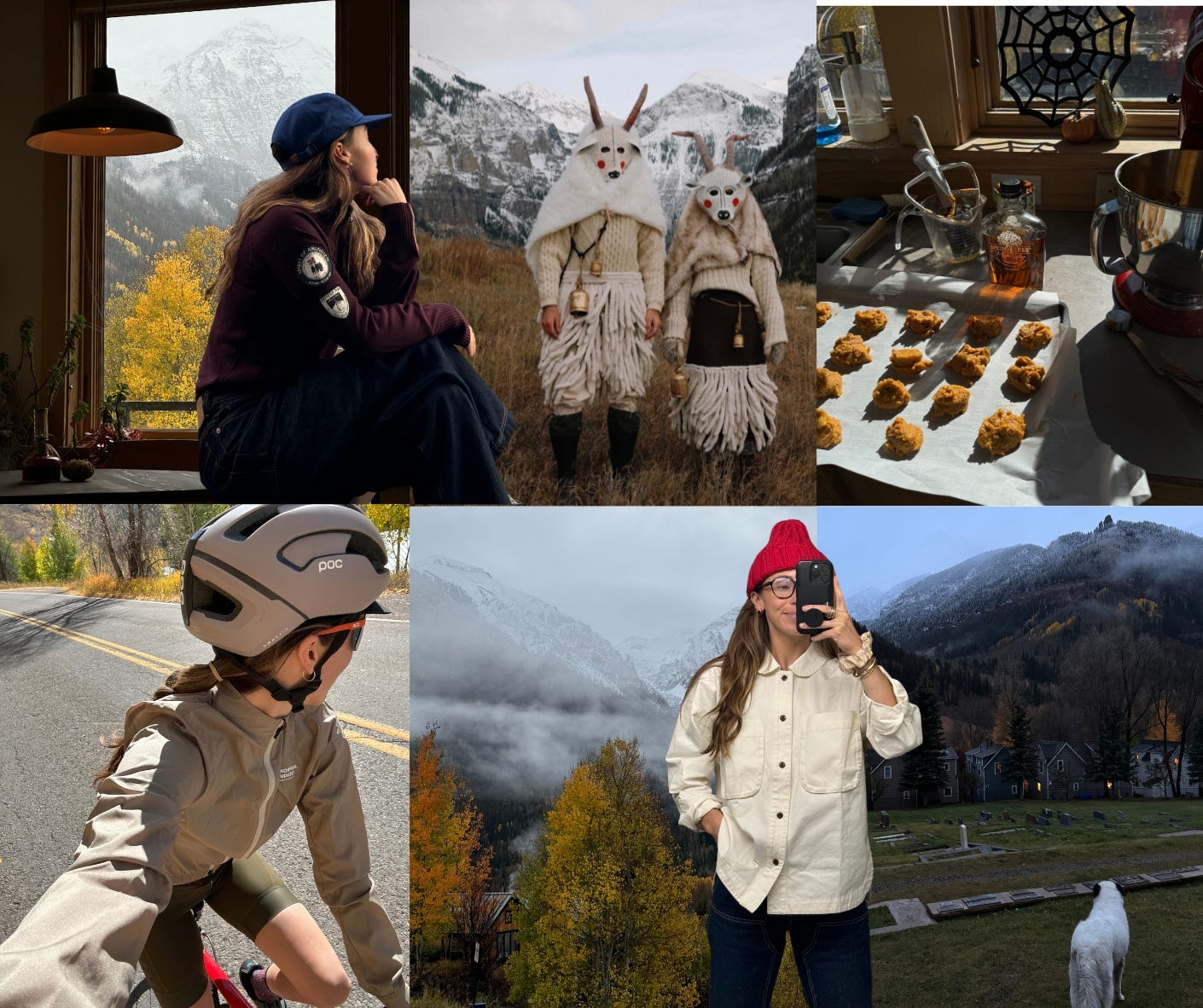
I’ve been up to my October antics which, this year, include paper mache-ing elaborate halloween masks, going on a historical lamplight cemetery tour, various leaf peeping excursions, and baking 4 rounds of failed pumpkin cookies. (I rebranded them as pumpkin muffin tops and then they were better.)

To me, October is such a whimsical and vibrant time. The shift into November feels a little more gritty. Like if October is pumpkin spice, arts and crafts, burgundy loafers and silk neck scarves, then November is worn-in denim, workwear, black coffee, and oil changes…you know what I mean? You guys know I like to nail my role, so if you see an uptick in waxed canvas and selvedge denim while I consider picking up smoking until the election is over, you’ll know why.
Back to it. A little background on TREW as a company-
(Also this is not a sponsored post! I just think it’s a cool insight on outerwear and what goes into the design/colors/art direction. And I’m proud of this!)
TREW designed their first ski bibs in 2008. A pair of rugged bibs built for the backcountry that came in bright teal and purple-
They shipped products out of their garage in Hood River, OR, and drove the gnaRV to resort parking lots and let locals take a spin in the bibs. Trew’s common thread of fun loving positive energy is weaved through everything the brand does and makes- community film projects, hut trip party laps, joyful colors, and people who don’t take themselves too seriously.
Today they’re based in Portland and have a small but mighty team of wonderful people with a great ethos behind them. They embody the “it’s less about what you do than how you do it and who you do it with” mindset. (I love that you’d never know they’re such a small business from the success of their products, but they are! It allows them to be nimble, do interesting collabs, and work with the little guys like me.)
With all of this in mind, I set out to pick this year’s colors. I wanted to keep the fun color blocking and happy, lighthearted energy that makes the brand what it is, but bring in some intentional and new color combinations. Genderless shades and mix and match-able palettes.
When looking for inspiration, I kept my eyes peeled in unlikely places. Nothing was off limits. Rather than looking at what other companies were doing or what Pantone color trends were, I tried to focus on colors that struck me when I saw them. Random menus at restaurants, family garments, airplane pamphlets, heritage outdoor pieces, plants, vegetables, kid’s clothes. And then think about which of those fit into today’s market.
Here are a few backstories and inspiration for some of the colors-
ALL of this was possible thanks to the TREW team- Chris Pew, Jess Joyner, and Katherine Donnelly who work so hard and kindly let me barge in with these ideas. They’re the BEST.
All photos below by talented photographer, Brian Tobin-
COFFEE/BLUE
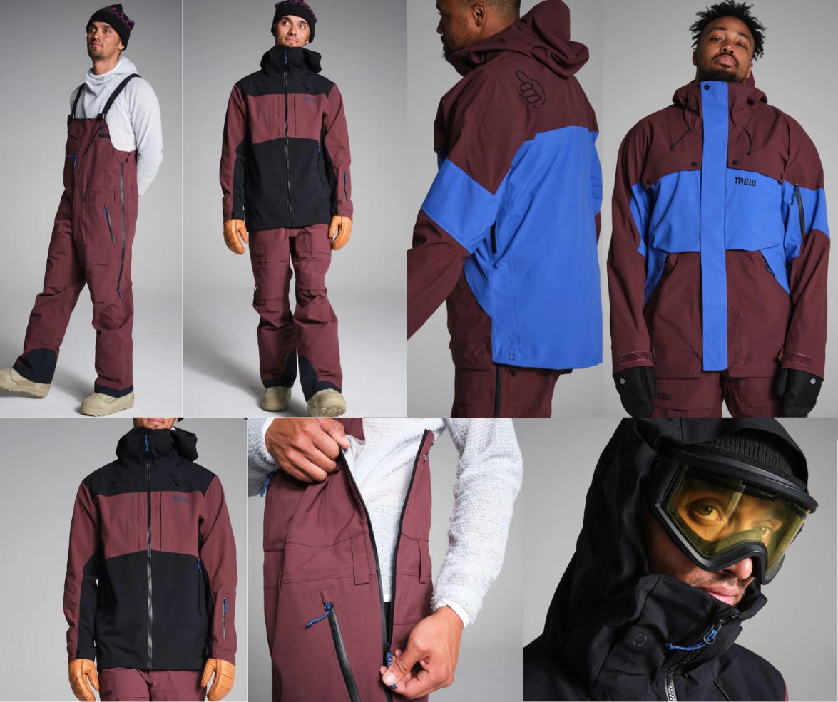
The first colorway I knew I wanted to make was a rich brown/cobalt combo. In previous TOGS letters I explored this combination and filed it away for later- I love the mix of one brighter and one more grounding color.
Here’s how it turned out-
& for the men-

There’s something about this perfect burgundy-ish brown color that just looks so good on everyone. I’m really so excited to see people wearing this out in the wild. Ugh I just love it.
ORANGE/EVERGREEN
This colorway was inspired by vintage (and current!) photos of people in the outdoors- green landscapes, blue skies and rivers, and people amongst it all in orange jackets and gear. I loved that orange is a typically a genderless color and while other brands may have wanted to put a more “predictably girly” color for the women’s version, I really advocated for the orange. I think it makes it poppy and cute and bright without playing into any specific gender.
This palette is so classically outdoors- an orange tent or an orange sleeping in the woods is perfection.
Here’s how it turned out-
I feel so strong and still so feminine in this one! A pop of orange around your face is so flattering on so many skin tones and looks truly incredible outside in the sun.
I’m obsessed with the knee patches (women’s pants rarely get these for some reason) and I love the various combinations for the men. Navy, Khaki, and the green/navy combo?! And the full spectrum on the Powfunk jacket! It’s just so fun.
I love this option if you’re more of a dark colors wearer but want something safer in the outdoors, and maybe hot pink isn’t for you. It’s unique, especially for women, and I love it for that.
POACHED PEAR
AKA dust khaki and chartreuse.
BRAT WINTER! SCALLION GIRL WINTER! MOSSY LICHEN ROCK WINTER!
Another classically bold TREW color with so much spunk! BUT still can be layered in different combos to have real workwear feel to it.
The original idea for chartreuse came a few years back thanks to my great Aunt Zona’s jacket that she made from a bath towel. (Pictured on me, above right.) Probably my most worn clothing item ever.
I just know this one is going to photograph so well outside in the snow. Like the vibrant moss and lichen in the old growth forests of the PNW. At first glance it might seem like a supernatural shade, but this bright chartreuse is one of my favorite colors because it is so abundant in the natural world. It’s alive!
And with the option to pair its with the Dust Khaki is just so cool. The men and women both have the option for a full Khaki kit which, (thank goodness) turned out to be the perfect shade of tan- not too naked or fleshy looking haha. Yay!
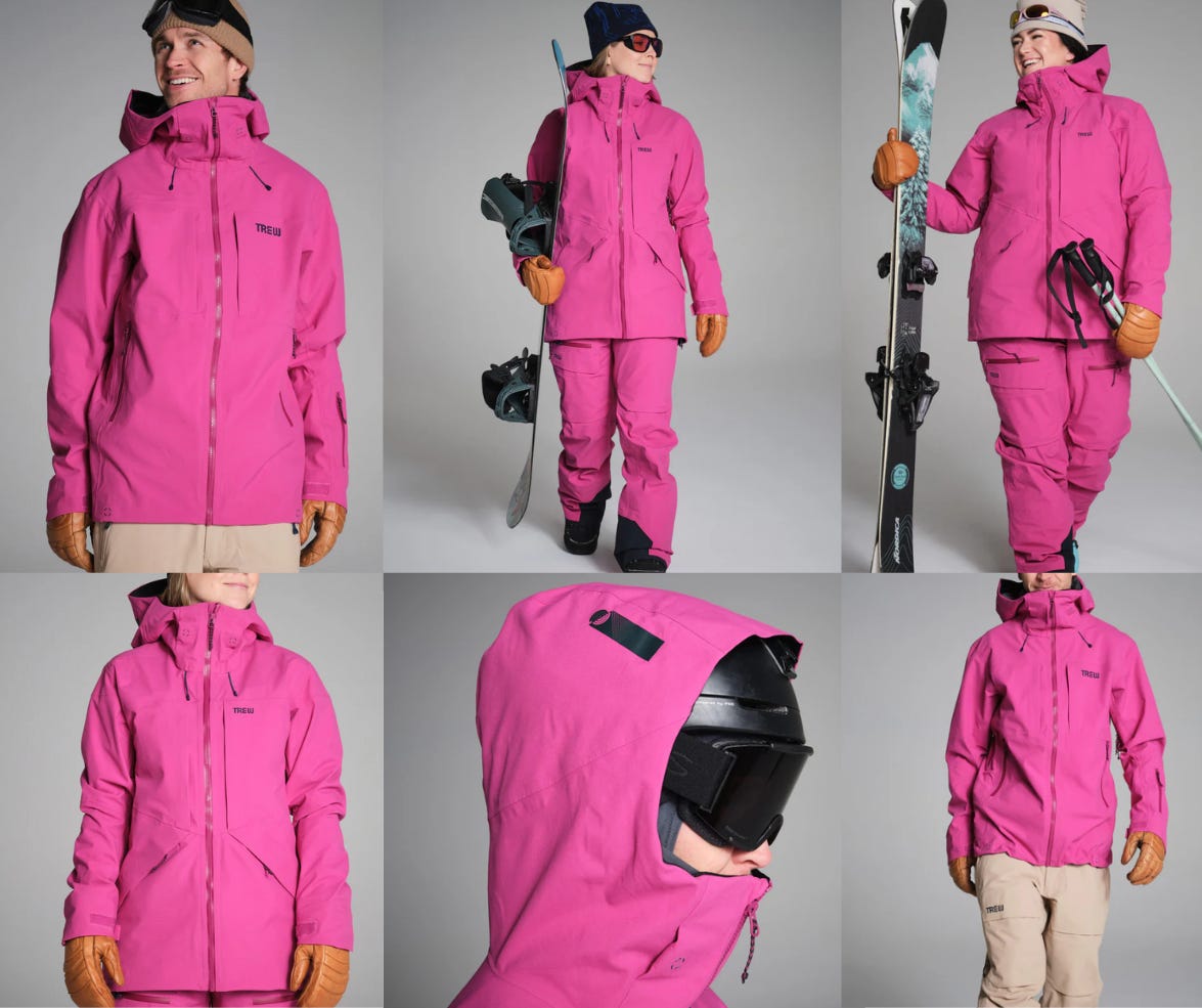
PINKBERRY
I’ll probably never be a pink girl myself, but I know and love and SEE YOU pink outdoorsy girls. Thanks for bringing the glitter on chairlifts and being the best skin track partners to us green girlies.
You can thank Chris, the big guy at TREW, for this gorgeous hot pink for the ladies.

And I had no doubt that the men would love this pink, so of course they get it too. I love to hear that the guys are already pumped on this one :).
Also this is a good time to mention that TREW thoughtfully designs a men’s and women’s plus size version of these same products as well.
I have to say, I do love this pink paired with the Khaki bibs. Another smashing bright/grounding color combo!
PURPS
Don’t worry, the iconic purp kits are back! I skied most of my days last year in this full purple kit and I’ve got to say…skiing in this color was so fun and I felt really confident. Big fan of this one.
I was fortunate enough to do the art direction for shoot as well, which was so exciting.
Here are a few shots that were on my mood board-
I’ve still been loving the outdoor winter action shots with blur and flash, so I wanted to bring that same energy into the studio.
I was hoping to get some super blurry shots for teaser photos, some fully enveloping color shots for the color story, and some crisp photos that still show movement with bright flash. Somehow our amazing photographer, Brian, deciphered and understood all of that and made the vision come to life.
For these artistic shots, I wanted the styling to have hints of street style and classic mountain elements, but not be pretentious or over the top. TREW is approachable and fun and never too cool, so I tried to balance it all.
Here’s an ~exclusive~ look at the photos from the shoot. I’m psyched.
(two things- 1.) the web quality of these photos are dismal and 2.) I am not a graphic designer and had no business making my own layouts like this… it’s simply just to show the photos ! pls look past me and Canva lol)
All photos by Brian Tobin-
Styling, art directing, and seeing this vision through to the end has been such a rewarding experience. I learned so much through the process of helping decide colors over year in advance and trying to please all sorts of tastes. It’s such a challenge but gosh it’s cool. I gained so much respect for the people who do this!
A massive thank you to Chris Pew & TREW for supporting me as an athlete and now trusting me as a creative. I’m so grateful.
I didn’t link any of the accessories or layers used here, but please feel free to drop a comment and I will link to anything!
Happy November and please send me a photo of you in your new ski kits if you happen to get one of these this year!! :)
Love,
Kellyn


love blue coffee. good work my love!
This was so cool to read! It's awesome to know the story and see your inspiration boards! I've been waiting for primo - and more specifically purps to be re-released since last year & bought a purps jacket for 24/25 but will say the coffee/blue and chartreuse colors did tempt me... So dope kellyn!